Some artists have taken that a step further, creating not just symmetrical portraits
The recent post about Palindrome as Art got me thinking about symmetry in language, specifically on the subject of ambigrams. Ambigrams are an interesting variation on palindromes: words or phrases written in such a way that they read the same when turned upside down. For example,
MOW
is an ambigram (using some fonts). A more interesting ambigram, and the earliest reference I could find to an ambigram, is the word "chump" written in cursive:
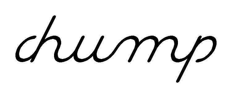
This is a more interesting variation, because as you can see, there is not a one-to-one correlation of one letter turning into another when turned upside-down. The c and h together become the p and the end of the m, and in fact, except for the c, each letter becomes part of two letters.
The modern ambigram uses distortion to create an ambigram. In this way, an 'a' can become an 'e' or even an 'o'. Another "trick" is to have seemingly superfluous marks that are ignored by the eye when read one way, but are noticed as being part of the letters when read the other way. Look at happy holiday for extraneous marks and happy birthday for distortion (although they both use both techniques).


In fact, using distortion one can make an ambigram out of virtually any combination of letters, although it's often so distorted that you can't decipher the ambigram without knowing what it's supposed to say. However, good ambigrams give the reader other cues, visual or otherwise, to assist in deciphering.
But I find the simplest and most pure (i.e., least unnecessary extra letter pieces) ambigrams the most aesthetically pleasing. Pure symmetry alone is not the answer. John Langdon's book on ambigrams is an excellent collection of ambigrams made by the author, and I suggest at the least you take a look at the cover. "Wordplay" as an ambigram delights me on multiple levels.
To return to the topic back to symmetry in art, why is it that certain asymmetry is also desired? Dali's paintings, Escher's drawings, even John Langdon's "Joy to You" are not perfectly symmetrical. Slight variation keeps the pictures from being too mechanical, too artificial. So despite scientific proof of our preference for symmetry, true artists know how to use asymmetry as well to create an aesthetically pleasing picture.
No comments:
Post a Comment